Uber is releasing an updated version of its app that aims to simplify and personalize the experience for customers.
Uber wants to user experience of its redesigned app to be more effortless and intuitive so that more customers see Uber as the “one-stop-shop for going anywhere and getting anything.”
The release will go out Wednesday to “tens of millions” of customers in 1,200 cities around the world, according to Uber. Customers will need to make sure their devices and Uber app have been updated to see the new app.
New Homescreen
The new home screen includes carousels that prompt a user with “More ways to use Uber,” “Ways to plan with Uber” or “Ways to save with Uber” which provide options for services like adding a stop along a route and more.
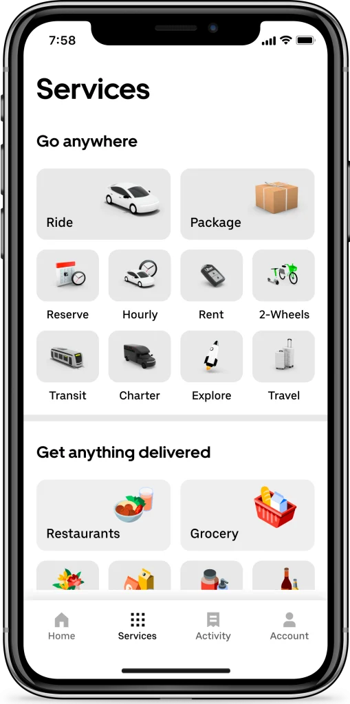
A new “Services” tab at the bottom of the screen provides the user with all of the ride and delivery offerings available in that city, like e-scooters, dinner options, car rentals, package delivery, and bus charter services, depending on the city the user is in.
Also along the bottom of the screen is a new “Activity” tab that helps users keep track of past and upcoming rides and Eats orders.
The new design will also have Dark Mode which alters the color scheme of the entire Uber app to darker tones, making it a more enjoyable experience to use our app when it’s dark outside or for users with light sensitivity conditions.
“We’re excited to announce a redesign of the Uber app, the first in a series of updates to make using the app more effortless and empowering consumers to go anywhere and get anything, easily. We know that life can get overwhelming, especially these days, and we hope consumers love the changes.” Marjorie Saint-Lot, Head of Ghana and Ivory Coast for Uber.
Updates to live tracking For iPhone 14+ Users
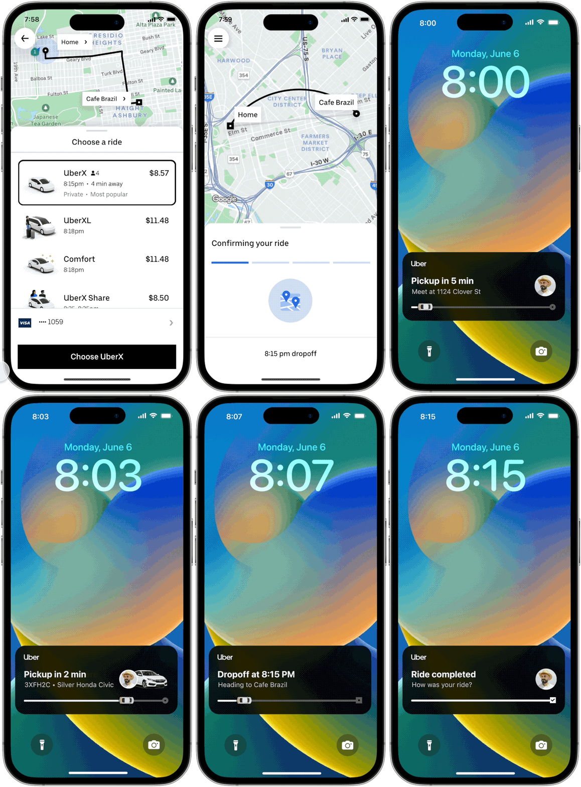
iPhone users running iOS 16 or later can track their rides all on the lock screen without having to open the Uber app via a “dynamic island,”.
Users will get notifications on their lock screen when a driver is on their way or close to pickup. The dynamic island will continuously run information like vehicle details — including driver photo, vehicle license plate, vehicle model and vehicle image — latest ETA information, and trip status.
Source: Techcrunch


