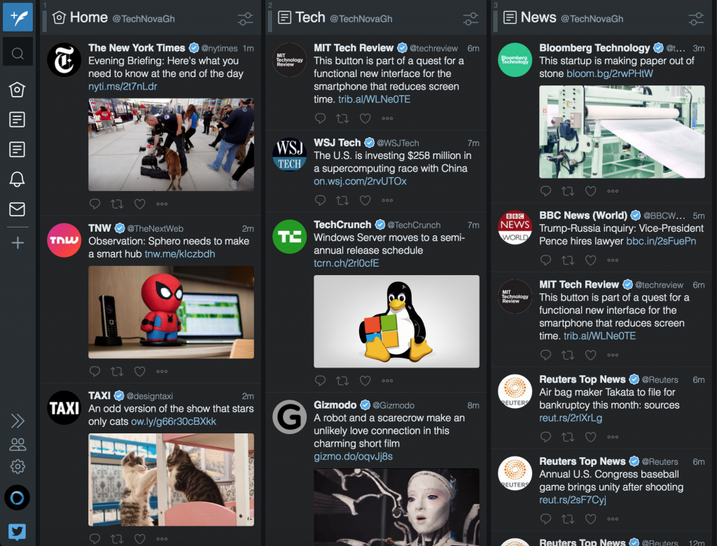
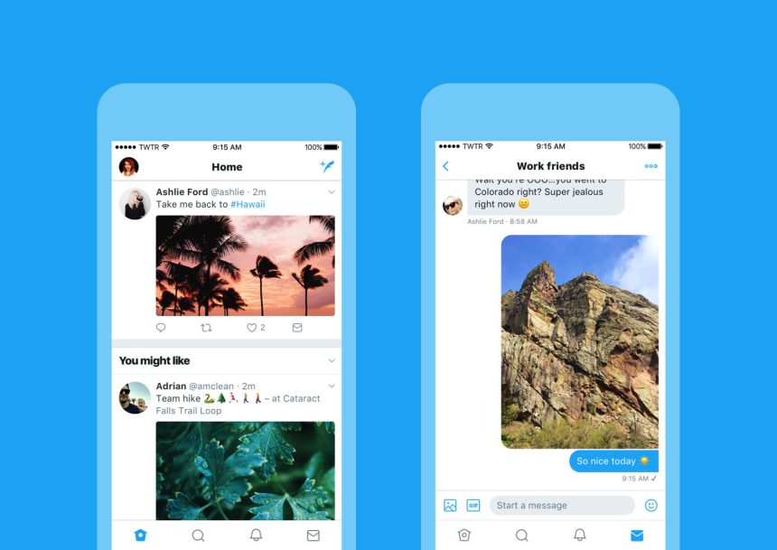
Twitter is rolling out a redesign for its mobile apps that brings a new and unified look to its app for Android, iOS, Tweetdeck, and Twitter Lite.
The new design moves the profile to a new side navigation tab while tweaking the app’s typography. The new side tab can be accessed by tapping the profile picture on the top of the timeline. It also lets you access your profile, Moments, and settings.
The In-app icons now show a softer, rounded design, with the reply button changed to a speech bubble.
/cdn.vox-cdn.com/uploads/chorus_asset/file/8688351/iOS_Timeline_and_DM.png)

I personally I’m not sure if Twitter users were asking for a redesign of their twitter apps. I think most users are stilling waiting for that elusive edit button that we all desperately want.

The new design is rolling out over the next several days. I noticed the update on my phone as well as my Tweetdeck.


