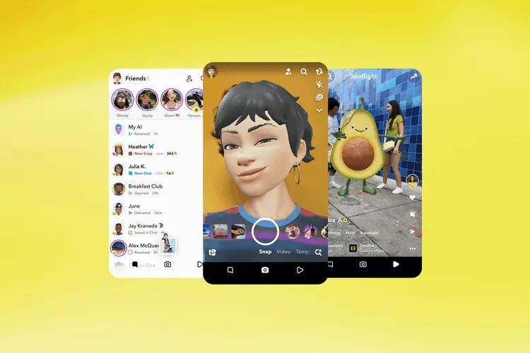
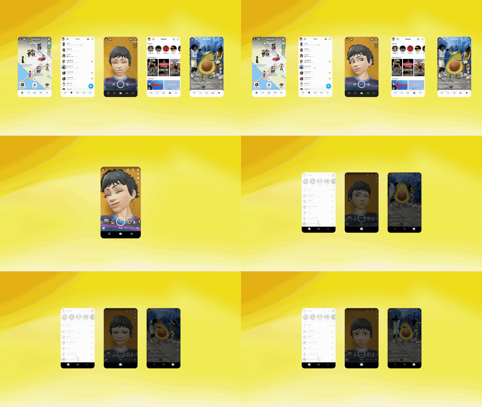
Snapchat is developing a new design for its mobile app. The company will be updating its five-tab design, reducing it to three tabs.
One tab will be for the camera, one for messages and stories, and one for a TikTok-like feed for videos from creators and publishers.

Details
The redesign, dubbed “Simple Snapchat,” was announced onstage Tuesday at Snapchat’s annual Partner Summit in Los Angeles.
Previously, the Snapchat user interface consisted of five main tabs:
- Snap Map
- Private chats
- Camera
- Stories,
- Spotlight
Zoom In
Snap Map will be accessible from the messaging tab, in addition to Stories from your friends and creators a user follows
Catch up on news and other tidbits on our WhatsApp Community Page, Twitter/X, and subscribe to our weekly newsletter to ensure you don’t miss out on any news.


